DESIGN STATEMENT:
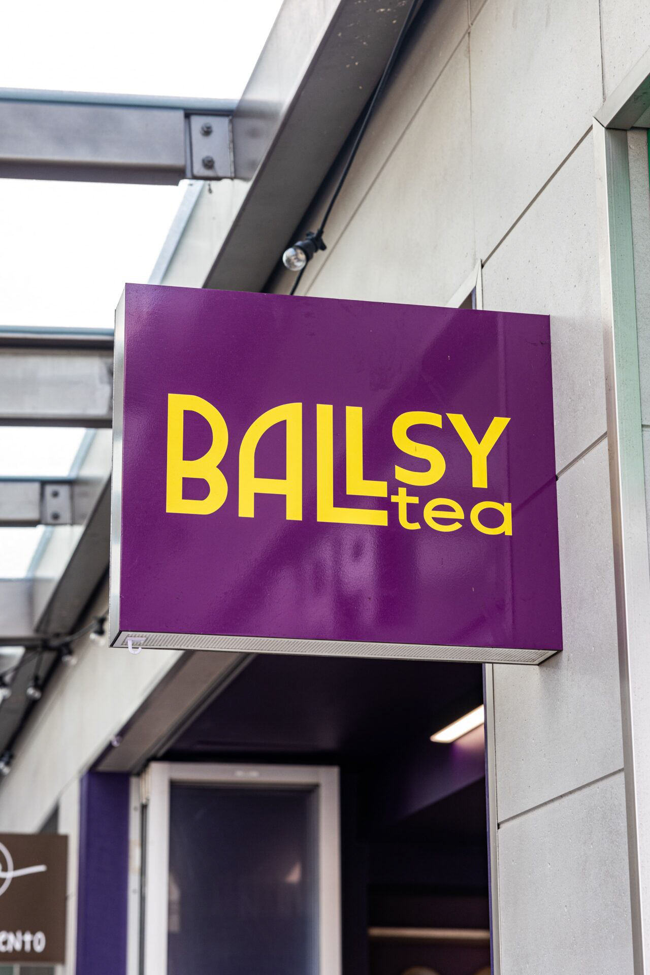
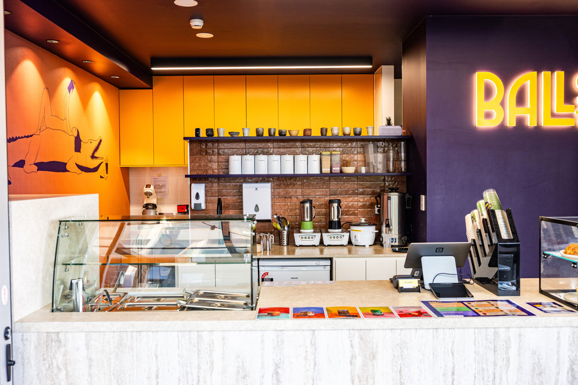
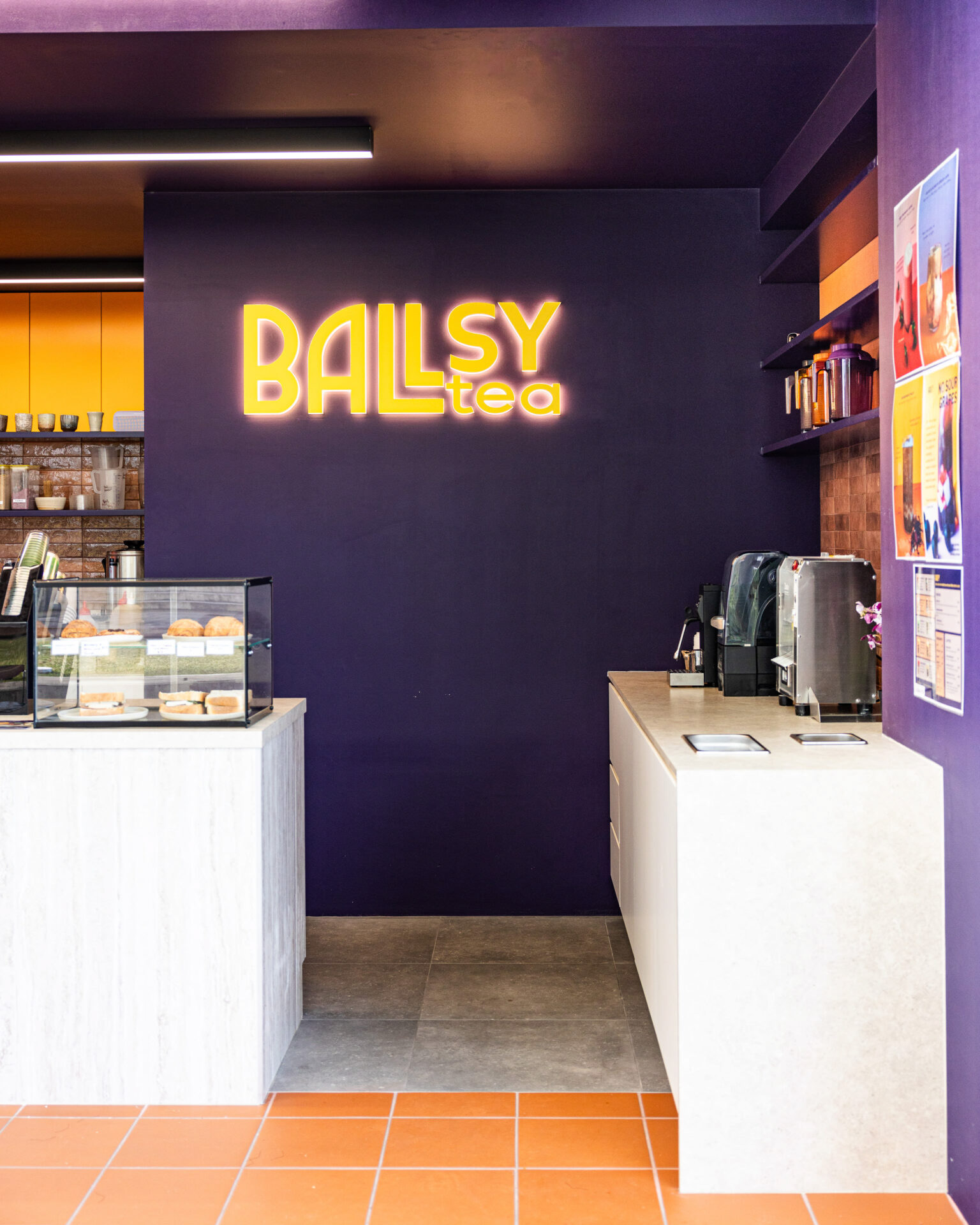
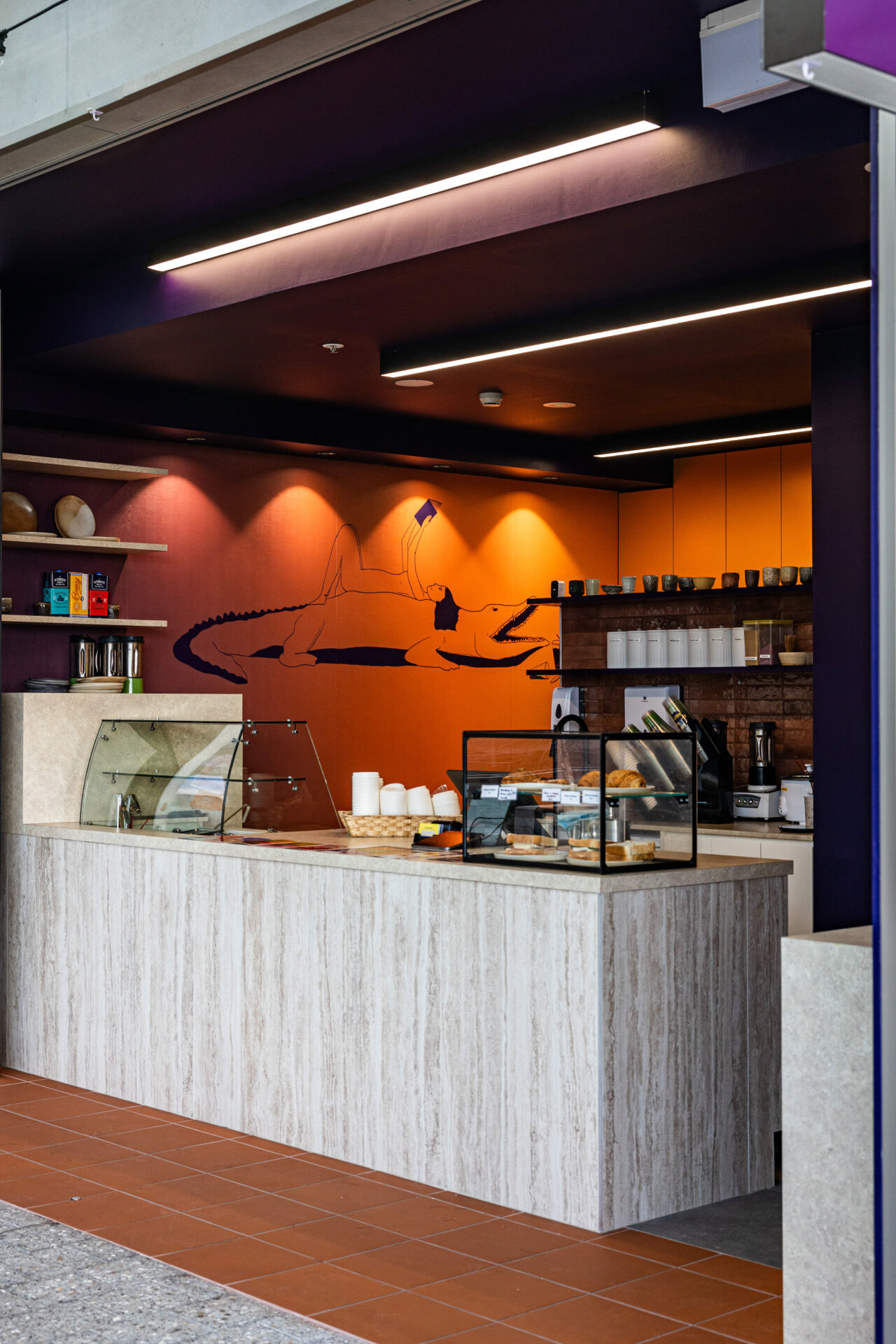
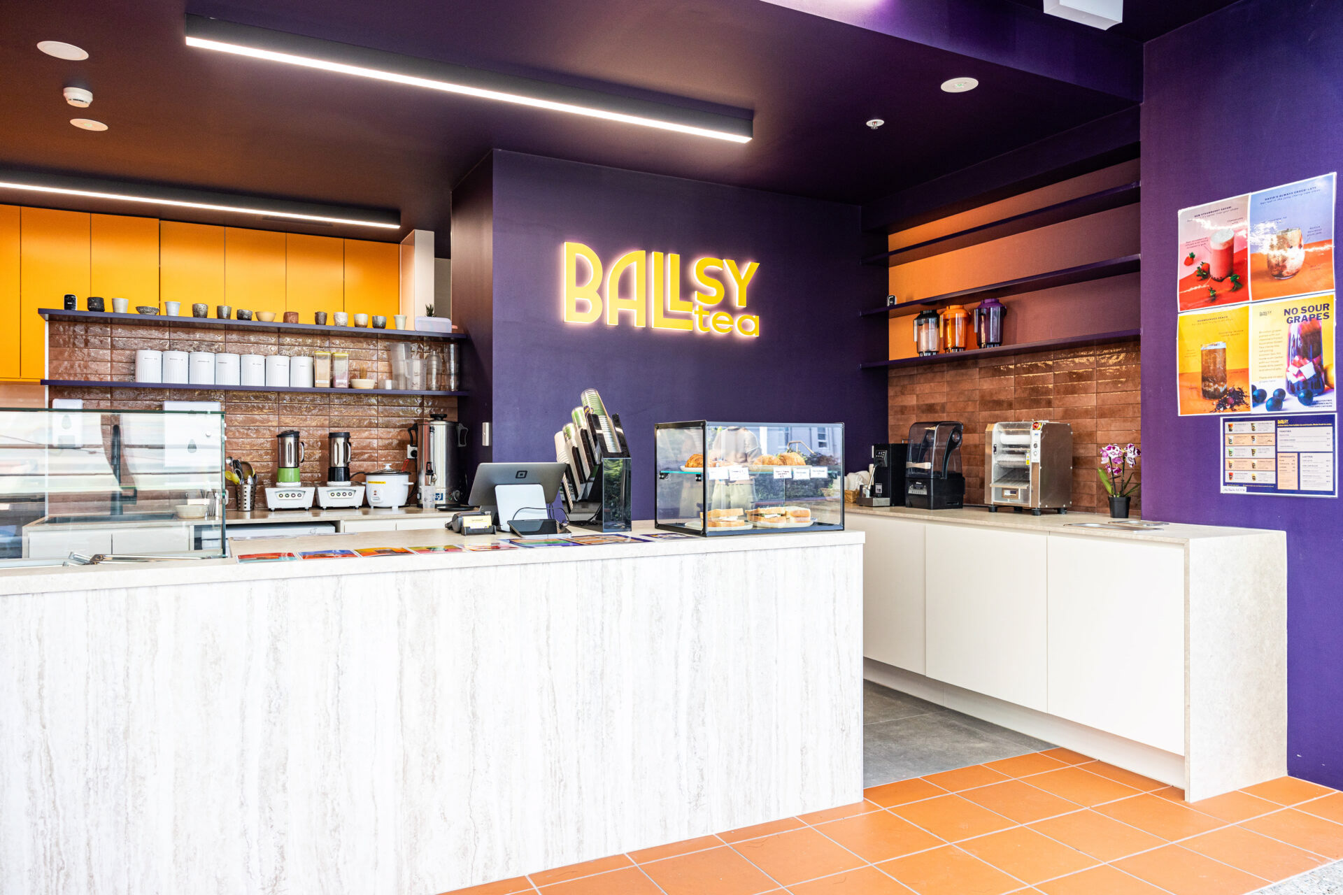
Ballsy Tea’s branding comes to life through vibrant colour choices, particularly the orange and purple ombre style that dominates the space. The gradient effect in rich purples creates a playful yet sophisticated atmosphere, reflecting the brand’s energetic personality. The clever use of colour psychology evokes both creativity and calmness, making the space visually striking while keeping it engaging for customers.
The minimalist layout of the commercial hospitality fitout is highly functional, with a clear flow between the self-service area, the prep station, and the service counter, ensuring a seamless experience for staff and customers alike. Well-placed counters and compact kitchen designs maximise efficiency without compromising comfort.